Learn how pastel filters can transform your photos!
Why Pastel Colours?
Pastel colours carry a certain genou c'est quoi that makes other colours pale in comparison to them (or them pale in comparison to others, we will cover that shortly), the method behind how pastel colours are created does not sound exciting however the end result can be well rewarding. Pastel colours are popularly implemented in crayon sets, home decor designs, clothing fashion, and in paintings. Pastel colours can change the feel of a photo and convey a greater amount of joy, fun, peace, and serenity. We will explore how you can use them as a photo filter for both professional photographers and smartphone users to add the power of pastel in your upcoming pictures. #Pale Canary
What are pastel colours?
The easiest way to explain pastel colours is to take a standard basic colour and reduce the saturation where the colour looks pale but still has a subtle vibrant effect. there are several ways desaturation can be achieved, the most common way is taking a colour and adding the opposite colour. Painters tend to add white to a standard colour which will dilute it and achieve a pastel look. In regards to photography for instance to create a pale blue you would specifically reduce the blue saturation slider in Lightroom/Photoshop and perhaps slightly increase the luminance to create a slightly vibrant look if necessary. #Jagged Ice
RGB Colour wheel
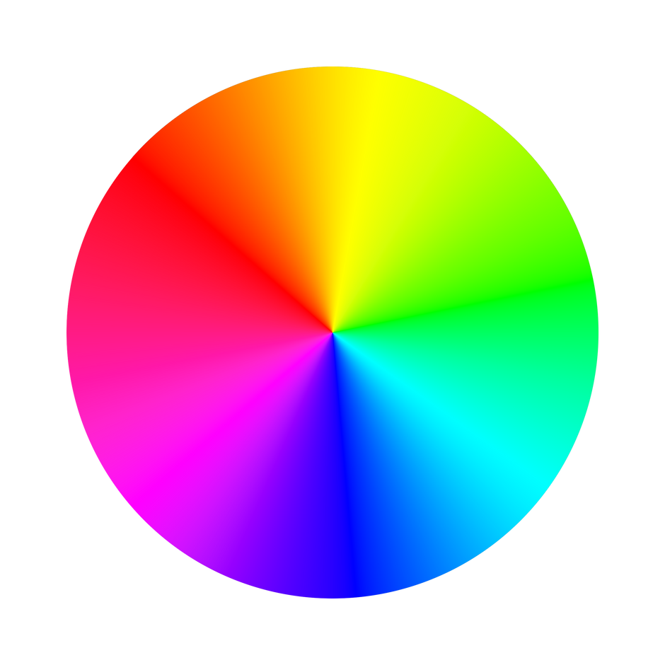
Every Colour has 3 values that together makes the colour unique, theses values are the Hue, saturuation, and brightness. Let's build a pastel colour while discussing and effecting the 3 values at each step.
Hue
There are 3 primary colours (red, green, blue) and 3 secondary colours (cyan, magenta, yellow), in total these 6 colours make up the RGB colour wheel as shown above. Every colour will have a hue value ranging from 0 to 360 depending where it falls on the hue scale. The hue represents the origin of the colour without adding any tint or shade, let's see what happens with this colour green when we change the saturation and brightness. #Hot green
Saturation
Saturation represents how vivid or strong a colour is. we perceive colour by looking at a green frog where the pigment in its skin is aborbing most colours but reflecting back green light. Whereby if we added a magenta pigment which is the opposite of green it will cancel out the green colour and eventually desaturate it to a grey colour. Alternatively if we add some white pigment (white reflects all light) it will dilute the green light being reflected making it a less stronger green. What we have done here is desaturated the above green colour from 100% saturation to 22%, now we are left with this new pale colour. #Very light green
Brightness
The brightness is how light or dark the colour is. The above green is good on its own, however lets reduce the brightness from 100% to 95% to balance it out. #Madang green
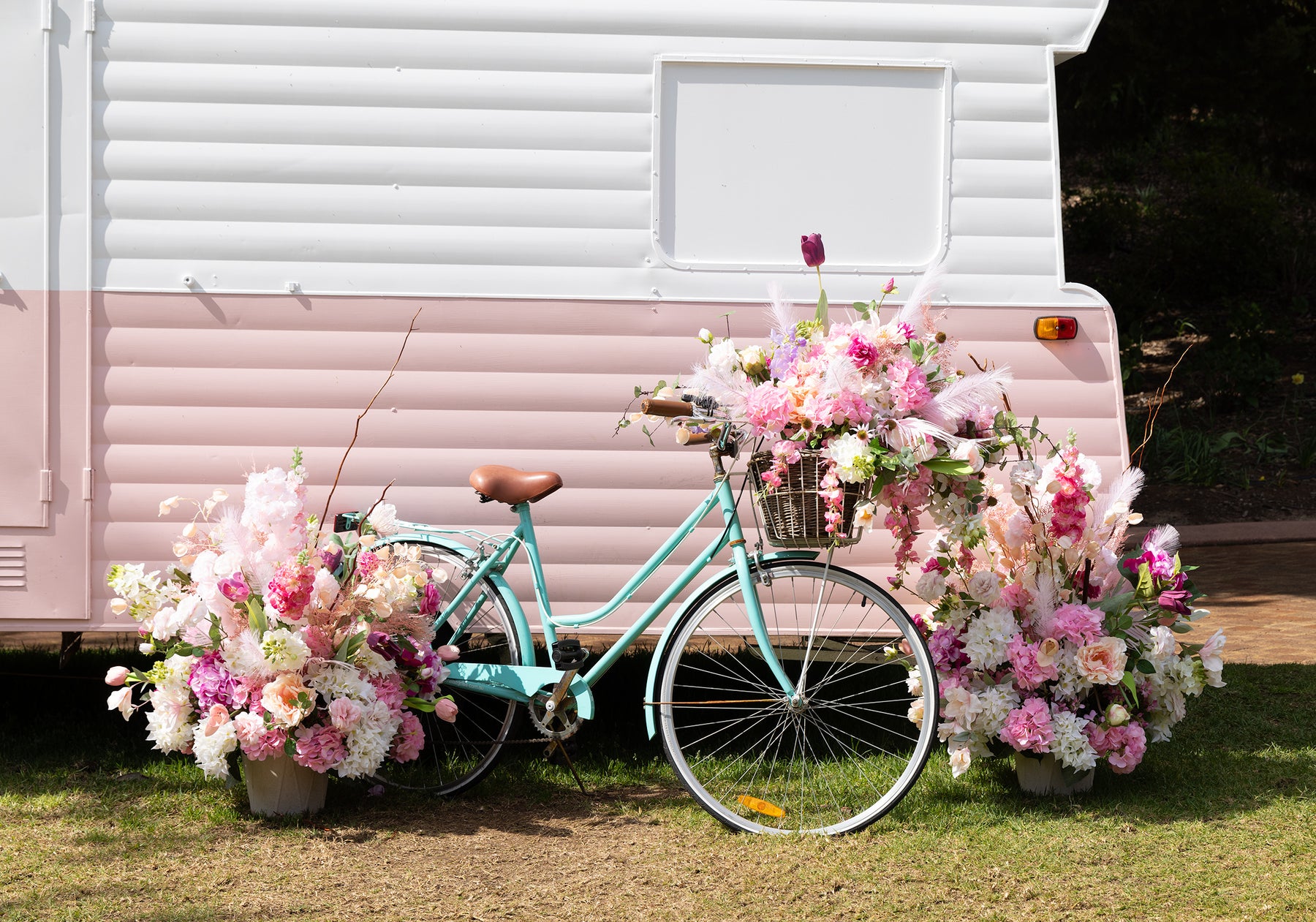
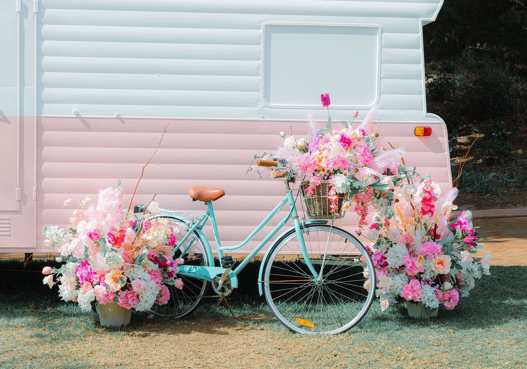
Fun & Joy
This pastel filter brings out the photos colour and joy to the surface
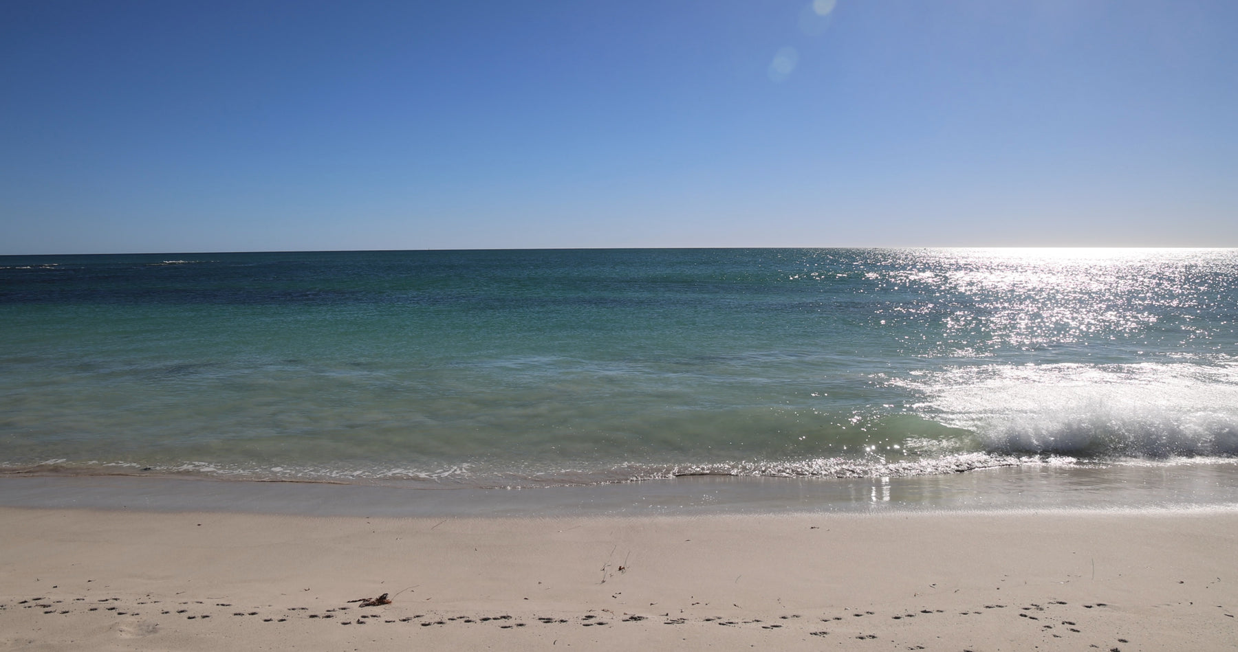
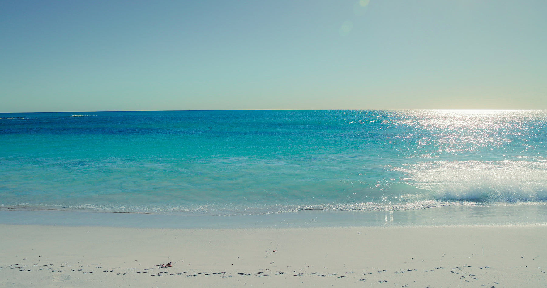
Peace & serenity
This pastel filter transforms this photo into a gateway of calmness and relaxation
comment below in english, french, spanish or another language about your experience, opinion, or a question you may have.
